Citroen's new logo
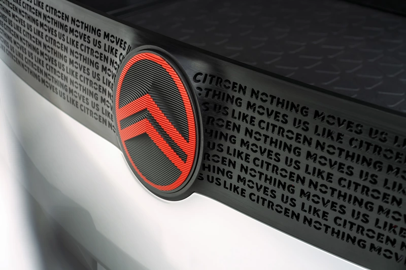
Citroen's famous chevron logo has been updated with a more modern look to better match the digital world. Fans can expect to see the new logo appearing on the French automaker's production and concept cars starting around mid-2023.
The Citroën logo has actually been changed many times throughout its history, and the latest version, the tenth, is actually a reproduction of the original design unveiled in 1919.
The history behind the Citroën logo comes from one of the greatest technological innovations in the automotive world, the helical gear, which is still used in almost all automobiles today. Before the advent of helical gears, transmissions were difficult to use and generally unreliable. On top of that, they were noisy and made driving unpleasant for both drivers and pedestrians.
Helical gears changed all this, providing the smooth power transmission between gears that we are accustomed to today. The logo resembles the herringbone pattern of the double helical gear. According to Citroën, founder André Citroën came up with the logo after being inspired by a metalworking company that manufactured double helical gears.
Citroen's new logo was introduced to indicate the automaker's shift in emphasis from internal combustion vehicles to electric mobility. It also introduces a new slogan, "Nothing Moves Us Like Citroën," and a new typeface that will be used on all digital materials in Citroën vehicles, including the infotainment system.
Other automakers that have recently changed their logos include Buick, General Motors, Lotus, Mini, Nissan, and Volkswagen.
